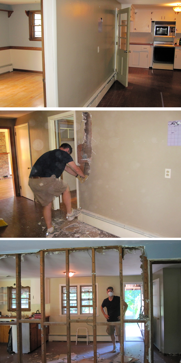
The wall that HAD to go. The kitchen was too dark and cavelike with the other room closing it off. Since I'm not big on first floor bedrooms, especially ones with windows right next to both home entries, we decided we could afford to lose it. In essence, we went from 4 to 3 bedrooms, but gained a dining room and an office space {which most people use a bedroom for anyway}. But honestly, it was one of the least expensive and most important decisions we made in this home redesign. It was a load bearing wall though, so we had the professionals come in to install the new support beam that was later approved by the inspector. Here's the hubby doing a good job of demo-ing:

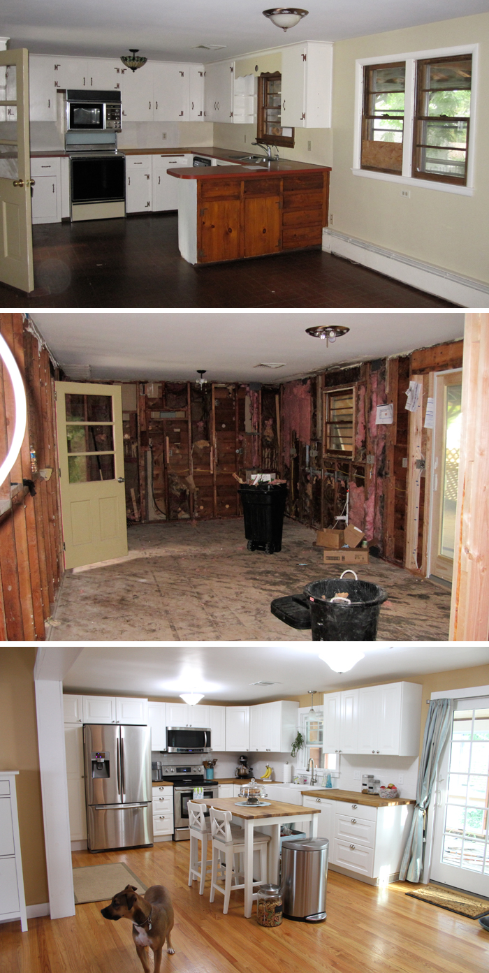
And here is the main cooking/eating/chilling out area. I went through about 2 dozen IKEA designs before I figured out where I wanted everything, and how to get the most storage out of the cabinet layout. It was a crazy and stressful process since we moved around the fridge, the stove and the dishwasher, but it has a nice open flow to it now. We lost the bar that was cutting the room in half and opted for a moveable island. We also decided on hardwood floors installed to match the existing ones in the adjacent room. No one can even tell the difference, our installer did an excellent job. We spend most of our time on the lower level of the house, so all of this was money well invested.

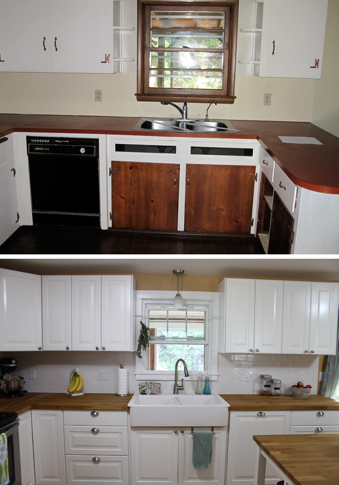
Here's a picture of my favorite sink {the second one, not the first!}. Everyone loves it and comments on it immediately upon entering the house, and the best part is, as far as farmhouse sinks go, it was fairly inexpensive. Thanks to IKEA, this only threw us back about 300 dollars. Well worth it, although, I have been known to break a glass or chip a bowl on it...

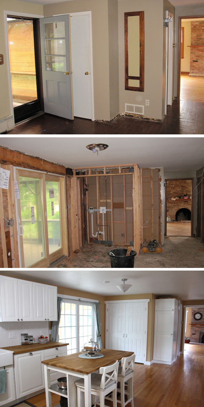
And another big decision we made in the structure of the room was to remove the very shallow food pantry and the back door, replacing it with a new laundry room and double slider. The slider lets in a lot more light than the single door and two small windows did, and the laundry room being upstairs is absolutely a must. Especially when you have a large belly and can no longer carry full baskets of clothes around.

Well that's that. The last thing we have left to do is a crown molding to finish off the tops of our cabinets, but that'll come later, once all the other little things are finished up. All in all, we probably spent about 15 thousand on this section of the house. We were able to keep our costs so low thanks to amazing IKEA products and prices and doing most of what we could on our own, such as demo, insulating, cleanup, painting and finishing work. We did splurge to have the cabinets installed, but mostly because looking at all those flat boxes that made up our kitchen was daunting, and we had a time constraint with moving out of our apartment in time. Other than that it was one of the most stressful things we've ever done as a couple! But then again, it's probably prepared us for this bebe...

4 comments:
That is a lot of work-and it looks amazing! Great job. It is so nice and bright and welcoming. Love the laundry area-I hate lugging laundry to and from the basement (I always had Danny lug it for me when I was preggo).
this is a really dumb question, but where did you get that towel hanger for the cabinet under your sink? i so need that!
oh yeah, and obviously, you did a great job with the remodel. the house is amazing!
Kelly, I think that came from Target...
Post a Comment