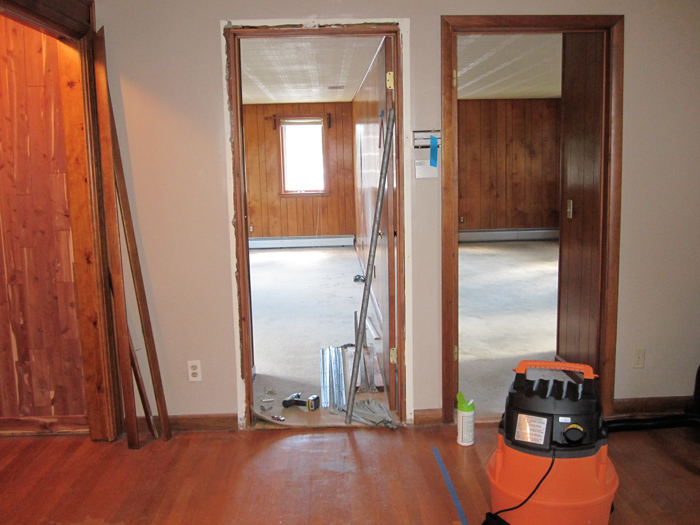
Here's what the hallway looked like before:
We decided that it was too confusing to have two rooms the same exact size, so we left the one on the right large so it would clearly be recognized as a master bedroom. Then we decided to put a hallway right down the center of the two doors and push the second bedroom wall back, quite a bit. Enough to make an open area large enough to hold the set of windows for natural light, and a desk and shelves for a usable computer area. This should come in handy when bebe decides she's going to get a Facebook account in 23 years, if Facebook's still around that is.
So here you can see the new wall and the office area, along with new doorways to the secondary bedroom and the master bedroom. Make sense?
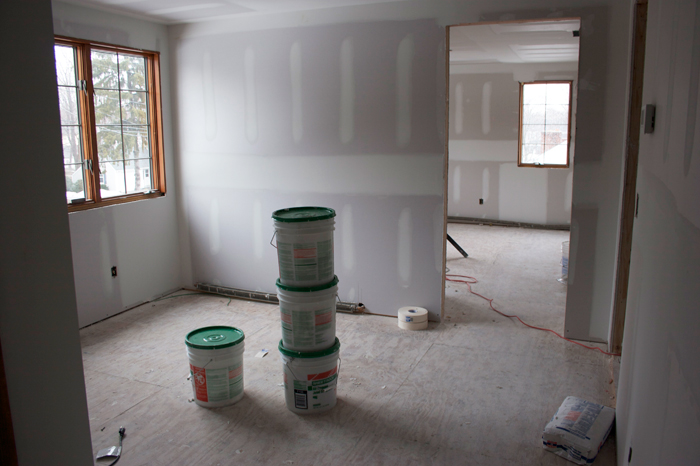
Here's the new office area painted and waiting for floors...
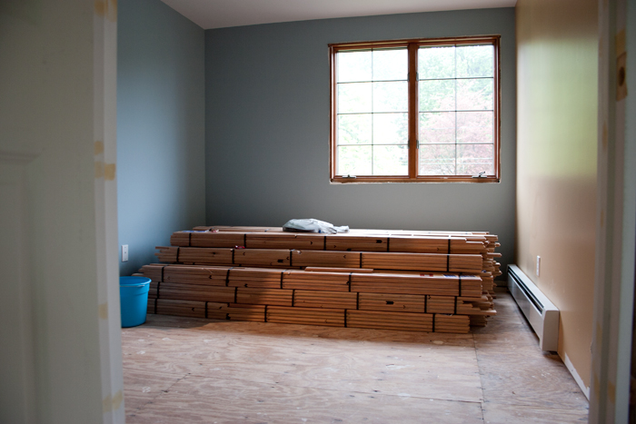
We really designed around having that set of windows in the hallway, to provide natural light and avoid the long hallway feeling like a dreary tunnel. It's nice and bright during the day:
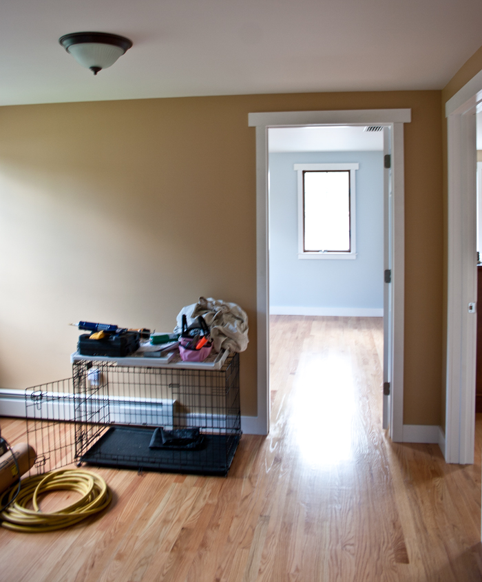
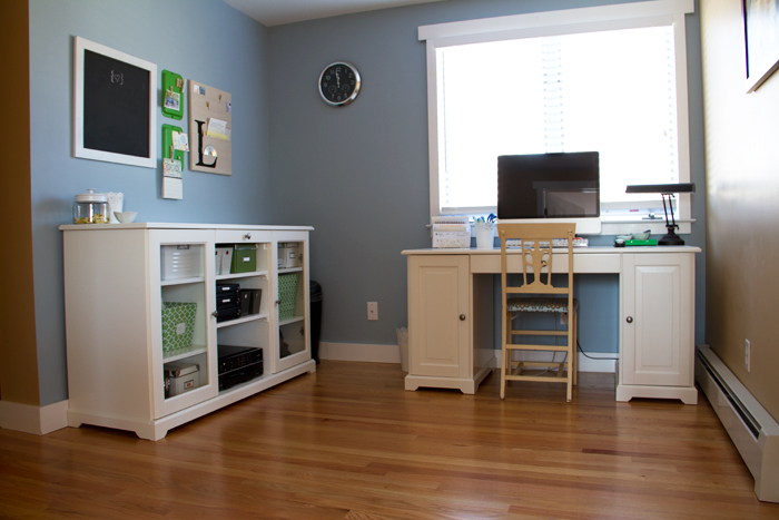
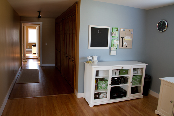
And the finished area, which personally I find is a great resource and space for both of us. I'm really glad we made the decision to rework the plans and have something that we could get a lot more use out of.
it looks awesome. i can't even wrap my head around all the redesigning y'all did! that's some serious skill!!
ReplyDeleteyour home looks unbelievable considering where you started from!! I love all your finishing touches!!
ReplyDelete