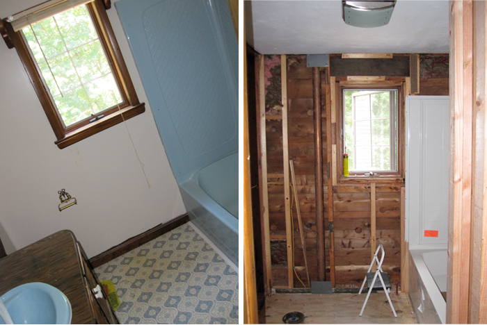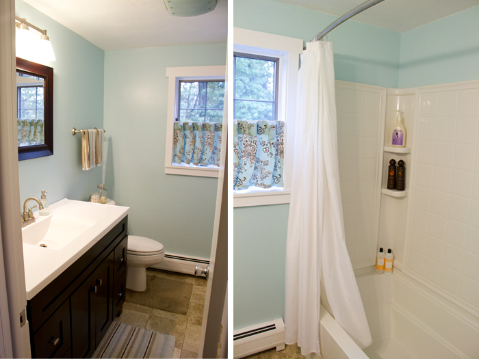
Well here's our upstairs {guest} bathroom before picture. Nasty yes? They really loved blue at the time, so the sink, shower and even the flooring all matched. Lovely. Those we knew we had to change. Then we realized the walls had to go too. They were a very thin plastic panelling, painted over, a bad decision all around. And that trim? Ghastly!
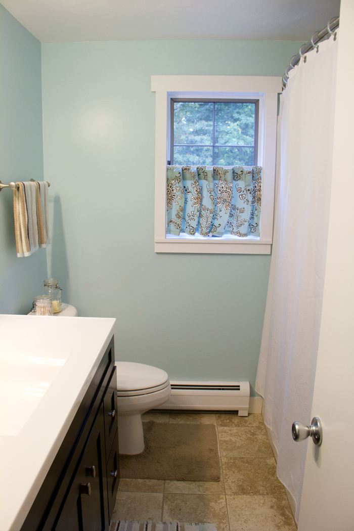
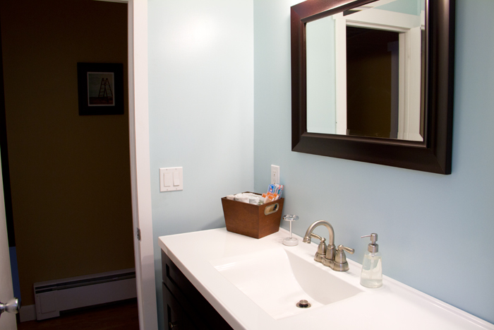
Once we had it down to bare walls we started making our design choices. The four piece tub we installed is fantastic. This is actually the second house we've put one in and they're very easy to install and even easier to keep clean. There's no grout to worry about so the white stays white for the long-haul. We also opted to match our vanity to the downstairs bathroom since we loved the countertop so much. This one has plenty of space for our guests to spread out and get ready. {The blue may end up changing, but for now I love it and the husband just deals with it.}


The only complaint we had about this bathroom, was the space. It's extremely tight when you have two people getting ready in the morning. My husband would bump into the doorknob all the time and that really drove him nuts. Luckily, for him, there was a bigger better badder bathroom on the way...
Love the paint color. What did you use?
ReplyDeletethat is a lovely update! I really like the curtain.
ReplyDelete